Like the phrase ‘beauty is in the eye of the beholder’, effective web design is judged by the users of the website and not the website owners. There are many factors that affect the usability of a website, and it is not just about form (how good it looks), but also function (how easy is it to use).  Websites that are not well designed tend to perform poorly and have sub-optimal Google Analytics metrics (e.g. high bounce rates, low time on site, low pages per visit and low conversions). So what makes good web design? Below we explore the top 10 web design principles that will make your website aesthetically pleasing, easy to use, engaging, and effective.
1. Purpose
Good web design always caters to the needs of the user. Are your web visitors looking for information, entertainment, some type of interaction, or to transact with your business? Each page of your website needs to have a clear purpose, and to fulfill a specific need for your website users in the most effective way possible.
2. Communication
People on the web tend to want information quickly, so it is important to communicate clearly, and make your information easy to read and digest. Some effective tactics to include in your web design include: organising information using headlines and sub headlines, using bullet points instead of long windy sentences, and cutting the waffle.
3. Typefaces
In general, Sans Serif fonts such as Arial and Verdana are easier to read online (Sans Serif fonts are contemporary looking fonts without decorative finishes). The ideal font size for reading easily online is 16px and stick to a maximum of 3 typefaces in a maximum of 3 point sizes to keep your design streamlined. 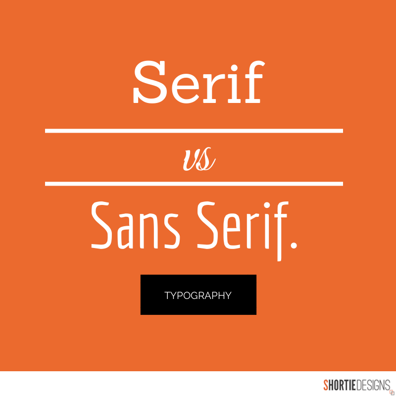
4. Colours
A well thought out colour palette can go a long way to enhance the user experience. Complementary colours create balance and harmony. Using contrasting colours for the text and background will make reading easier on the eye. Vibrant colours create emotion and should be used sparingly (e.g. for buttons and call to actions). Last but not least, white space/ negative space is very effective at giving your website a modern and uncluttered look.
5. Images
A picture can speak a thousand words, and choosing the right images for your website can help with brand positioning and connecting with your target audience. If you don’t have high quality professional photos on hand, consider purchasing stock photos to lift the look of your website. Also consider using infographics, videos and graphics as these can be much more effective at communicating than even the most well written piece of text.
6. Navigation
Navigation is about how easy it is for people to take action and move around your website. Some tactics for effective navigation include a logical page hierarchy, using bread crumbs, designing clickable buttons, and following the ‘three click rule’ which means users will be able to find the information they are looking for within three clicks.
7. Grid based layouts
Placing content randomly on your web page can end up with a haphazard appearance that is messy. Grid based layouts arrange content into sections, columns and boxes that line up and feel balanced, which leads to a better looking website design.
8. “F” Pattern design
Eye tracking studies have identified that people scan computer screens in an “F” pattern. Most of what people see is in the top and left of the screen and the right side of the screen is rarely seen. Rather than trying to force the viewer’s visual flow, effectively designed websites will work with a reader’s natural behaviour and display information in order of importance (left to right, and top to bottom). 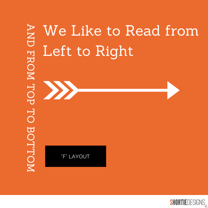
9. Load time
Everybody hates a website that takes ages to load. Tips to make page load times more effective include optimising image sizes (size and scale), combining code into a central CSS or JavaScript file (this reduces HTTP requests) and minify HTML, CSS, JavaScript (compressed to speed up their load time).
10: Mobile friendly
It is now commonplace to access websites from multiple devices with multiple screen sizes, so it is important to consider if your website is mobile friendly. If your website is not mobile friendly, you can either rebuild it in a responsive layout (this means your website will adjust to different screen widths) or you can build a dedicated mobile site (a separate website optimised specifically for mobile users). 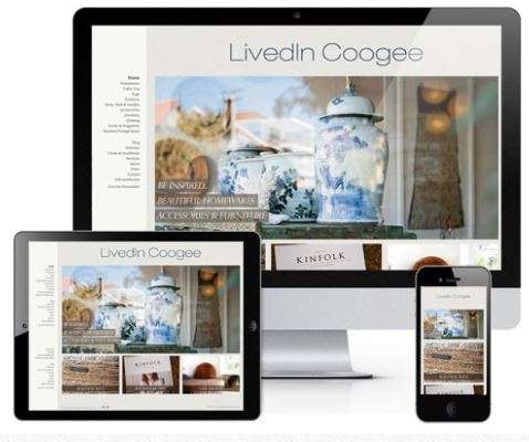 It is easy to create a beautiful and functional website, simply by keeping these design elements in mind. Have you got a website design that needs reviewing or optimising? Or perhaps, you are planning a website and you are looking to get the design right from the ground up. Either way, these principles of effective web design can help your website be more engaging, useful, and memorable for visitors.