Are you about to start a re-design or perhaps you’re embarking on a new site? Your website can be a vital part of building your business profile, both offline as well as on-line, if you make the most of it. Here are 6 important things to help you get the most out of your website.
1. Know Your Website Goals
What is the purpose of your site and how is it supporting your business? Are you trying to gain sales leads, bookings, provide information, increase newsletter signups or sell products? Whatever the case, you need to be very clear about your website goals so you can design and build the site accordingly. Once you identify these, you’ll be able to measure the success of your website better and know how it’s performing against your goals.
2. Make is Usable
Usability: Measure of the ease of use on a website by its visitors.
– Web definitions
Your website might be the latest responsive CSS3/HTML5 bootstrapped bonanza, but this doesn’t necessarily mean that your visitors can interact with your site in a way that’s meaningful for them. Making sure your site is user friendly helps your visitors complete tasks successfully, engaging visitors and helping conversion. Usability is a complex and detailed component of good web design, however here are a few pointers to get you started. Implement these accordingly and you’re on your way to helping your visitors achieve the goals you’ve set out for your site, thus
a) Navigation: Make sure your navigation is intuitive and consistent. Not everyone enters your site via the home page so keep navigation consistent across the site and use obvious page names to categorise different parts of your site.
b) Readability: Make sure your text is readable and not obscured by background images or distracting animated elements. Use a decent size font size, Smashing Magazine advises 16px (0.063 em) for body copy. This will of course depend on the type of font that you use.
c) Write for the web: Remember, people read differently on the web than on print. Give your content some room to breathe. Use white space to break up content and don’t be afraid of breaking information up into paragraphs. Small amounts of clear and concise copy will engage your visitors far better than too much information. You can read more here about writing copy for the web.
d) Link recognition: Ensure that your hyperlinks are easy to recognise, so make sure they stand out from your normal body copy. Colour and underline link text so that users don’t ever have to guess where they need to click.
e) Information design: Place important information to the top left of the page (if you are making a website in English). According to research English speakers spend most of their time at the top left of the site.
f) User centered approach: Rather than thinking about all the functions, widgets and slideshows that you think will make your site the coolest kid on the block, think about what your user needs to achieve their goals. Work from here to map out the type of content and functionality for your site.
3. Write Fresh and Engaging Content
Good content will engage your visitors and encourage them to come back. So whether it’s regular blog posts or updated galleries, videos or information, keep it regular and fresh. Make sure you let people know about your new content too, either through your social media profiles, or by enabling people to subscribe to your content by email or sending out updates in regular e-bulletins.
4. Use Quality Photographs
The web is a visual environment, so if you use photographs for your website make sure they are good quality and optimised for the web. This is particularly the case if your site is an online store or gallery; beautifully shot images will get buy in much quicker. So instead of posting those grainy backyard shots of your home made boutique furniture, get some high quality professional photographs that show your product in the actual environment it’s going to be used. Make sure your images are then properly optimised for your website so it doesn’t impact on speed and load time, because a slow site will only drive visitors away.
5. Monitor and Analyse
If you haven’t already installed Google Analytics on your website, then now’s the time! This free and very powerful analytics tool can give you information about how long visitors stay on your site, what they’re reading, the browser or device they’re using when they access your site, or even where they are in the world. All very useful in measuring how your website is performing and how you can better target your content.
6. Mobile Friendly
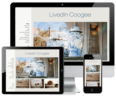
We’re in the midst of a mobile revolution and more people are accessing the internet on their smart phones and tablets than ever. How is your site performing in these devices? Now’s the time to check. You may have heard of responsive websites, but if you haven’t, responsive websites are designed to fit to any browser no matter what the size. It’s a great way to make sure your site is smart device friendly without having to build an app or a mobile version of your site (thus saving you money and time). Use your analytics to see what content your visitors’ browse to when they’re on their smart devices. Often it’s contact details, services or information about your business. Responsive design is a clever thing and you can use it to show targeted information easier to your visitors on their devices. This is a great way to help people engage with your business no matter where they are.
What do you think? How do you make the most out of your business website?
Use the comment box below to join in the conversation.
