[updated] April 21st saw Google’s new search algorithm which will greatly preference websites that are responsive or have a mobile version. If you don’t have a mobile friendly website, then from April 21st, you will start to see a drop in your rankings.
Why is Google doing this?
With the extraordinary number of people using their mobile devices to go online, Google has seen the currency in ensuring our mobile device-centric world is catered for and has been prioritising mobile usability in search results for quite some time. You may have noticed that sites have been tagged ‘mobile-friendly’ in search results, in an effort to navigate mobile users to a better, higher quality experience on their devices. Google has been ranking mobile friendly sites better than non mobile, but the way in which the search giant has been doing this has been shrouded in mystery, and as a result many businesses have put off converting to a mobile friendly site.
Starting April 21, we will be expanding our use of mobile-friendliness as a ranking signal. This change will affect mobile searches in all languages worldwide and will have a significant impact in our search results. Consequently, users will find it easier to get relevant, high quality search results that are optimized for their devices.
– Google You can read the official announcement from Google here.
How will this effect my rankings?
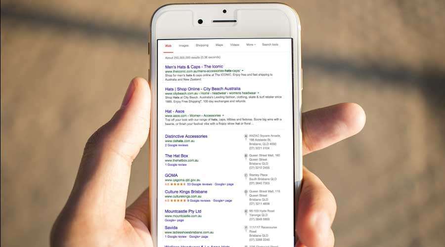
From the mouth’s of Google, there will be a ‘significant impact of our search results’. Let’s be clear, Google are referring to search on mobile devices only. So if your site is currently ranked no#1 on desktop, but is not mobile friendly, it will drop in ranking on mobile search results. For example, if your site is an online shop, but isn’t mobile friendly, from April 21st, your SERP position (search engine results page) will drop on mobile search. This means less traffic from mobile, which means less sales. If you think that it doesn’t matter because this is only targeting mobile search results, then you’re very mistaken. Just in case you’ve been living under a rock, the western world is in the midst of a mobile revolution. In 2013, two thirds of Australian’s alone own a smartphone, with just over 70% regularly on their mobile devices. This amount is likely to be higher for 2014 and even higher for the end of 2015. In the USA 55% of US consumers shop online with their smartphone. So searching, browsing and purchasing on mobile phones are key actions your target audience will be performing, so you need to make sure you’re website is in the equation if you want to get found.
What does this mean for my site?
In a nutshell, the algorithm means that if you’re site isn’t responsive and suitable for mobile screensizes, you’re business is going to see a fall in traffic. The simple solution to this is to get a mobile friendly website. So if you’re about to embark on a redesign, make sure you factor in responsive and mobile friendly design to ensure you’re not loosing ranking and your business is still benefiting from all the SEO work that you’ve invested in. Not sure if your website is mobile friendly? You can analyse your website with Google’s mobile friendly test.