If you’re feeling frustrated by your conversion rate i.e. the ratio of site hits Vs actual sales, you’re certainly not alone. And while it’s easy to become disheartened by abandoned shopping carts or lack of contact, you may be surprised as to what’s normal among your competitors. According to Smart Insights, the average conversion in online retail is 2.9%, with hospitality and travel slightly behind at 2.6%. Feeling behind? Not a problem, this blog is designed to help you figure out where you may be going wrong, and how to increase your chances of converting your sales.
1. POP-UPS & FORMS
While pop-ups are great for offering discounts and collecting data, asking for too much information (or email sign-ups) as soon as someone lands on your page can be quite off-putting. Not only this, if your pop-ups aren’t converting to mobile properly, your visitors can find that they can’t get past the pop-up to visit your store/site at all. So be sure to test your site across all devices. If you want to create offers and encourage sign-ups by using pop-ups, by all means do! But remember that timing can be everything. Allow your users to view your product/s first and then come in with an offer. When it comes to asking a brand new visitor for information about themselves, always allow them the opportunity to decide if they like what you’re offering first. When asking for personal info, ask for the bare minimum to allow for a functional database for your business. Asking too many questions can deter users, and with so much information being asked of people each and every day on the web, we need to remember that some information is sensitive, and not all should be shared with an online retailer. In reality, apart from a birthday month offer, there’s no need to ask your users for their exact date of birth.
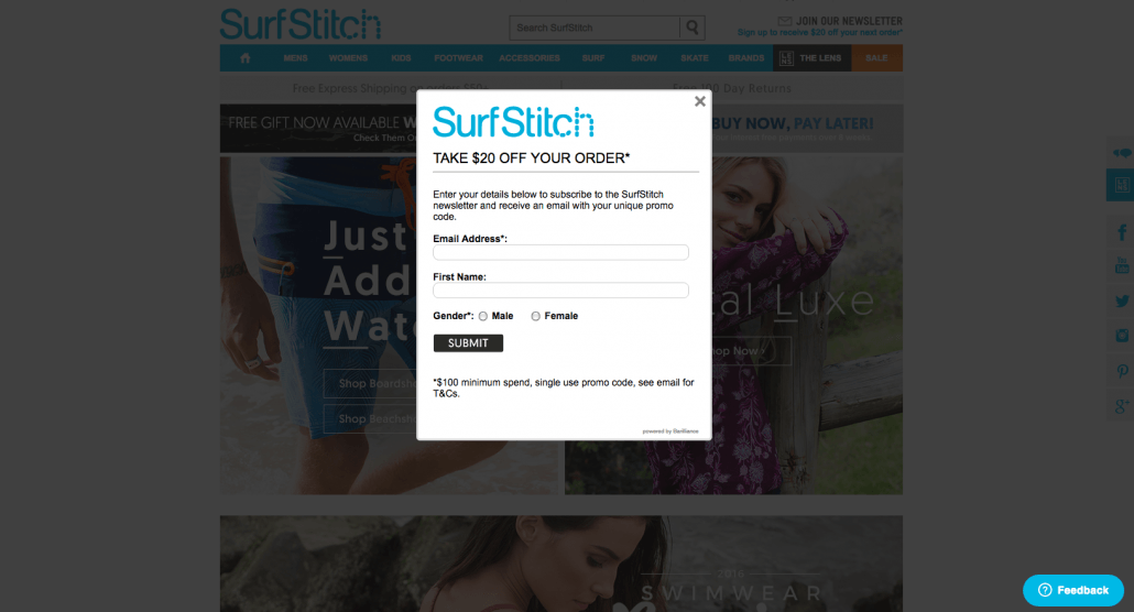
Screenshot: pop-up form from www.surfstitch.com.au
2. IMAGERY
If your site is your main source of drawing-in business, be sure to show graphically exactly what you do, illustrate the purchase or engagement processes, and when it comes to products, professional photography is a must! For online retailers, for example fashion, clothes worn by models have a much higher sale rate than clothes shown on the hanger, or flat-lay images. Before an online purchase is made, the consumer wants to see multiple photos, so don’t be shy on uploading lots of angels, different lighting etc. The more photos the better in most cases. Don’t leave any questions lingering regarding how the purchase process works. Having a graphic that shows the process from making contact to you to how they receive their goods can be great for getting that sale over the line. We love this example from Mon Purse for monogrammed leather goods.
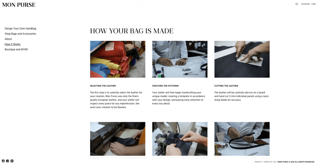
Screenshot: production process imagery from www.monpurse.com
3. CONTACT & CALL TO ACTION
If you’re in the business of trade, for example, a plumber, it’s likely your customers will want to make contact ASAP – the same applies to home delivery meals etc. Having a “call now” button is imperative for your business and the convenience of your clients. Email forms simply won’t cut it in this environment. Live call buttons in the header, an online chat pop-up, and further details (email and address) in the footer are ideal. Want all three to maximise the opportunity for contact and boost your conversion rate? Go for it! In a nutshell, provide your visitor with multiple contact opportunities. In this day and age consumers simply won’t write down a number with a pen and paper, so make sure they can click on your phone number and call straight through.
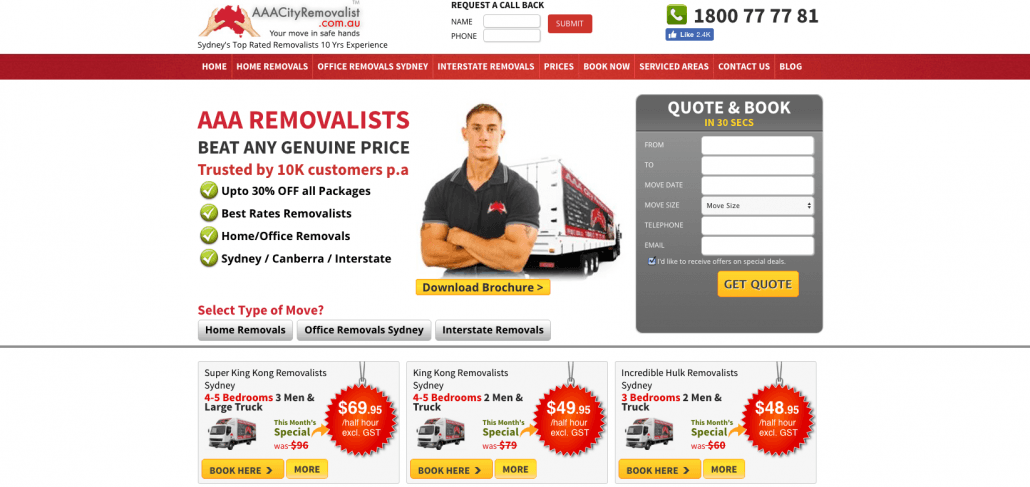
Screenshot: Call to action examples from www.aaacityremovalist.com.au
4. TESTIMONIALS & REVIEWS
Want to create a trusting relationship with your potential clients? Even when you can’t meet them face-to-face? Online reviews are a raw way to learn about a service, as keyboard warriors tend to provide very honest feedback! If you want to learn and grow from your clients, and share their experiences with future clients, offer them a feedback form or review page. You can choose what you share on your page and provide your potentials with a deeper insight into elements of your business such as customer service, shipping time and costs, quality of the product or service. These not only work really well on social media, they will add a human element to your page. And, don’t be shy to share your stats! We really like how Jazz recruitment services has shared their statistics and testimonials. They’ve been completely transparent with their accomplishments – what you see is what you get! The bottom-line is looking credible and trustworthy and these guys have nailed it.
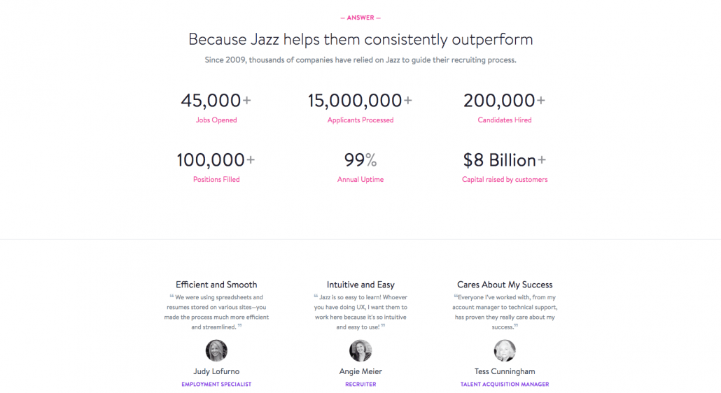
Screenshot from www.jazz.co
5. CHECKOUT
One of the biggest gripes with online shoppers is filling out forms and setting up an Account to purchase. Further more, one of the biggest gripes from return customers is forgetting their password and not being able to purchase. This is the fastest way to lose a sale to a competitor! The solution is to offer a Guest Checkout option for first time users and return users. Think about it like this, you may not be adding to your database, but you’ve made a sale. Worth it? We think so! In terms of payment, accepting credit as well as PayPal is a no brainer. PayPal is the most secure way to pay for online services, so make sure you offer it. It also streamlines the entire payment processes as there’s no inputting of credit card details and address details are auto-filled – saving the consumer time as well as the stress of handing over sensitive information. Afterpay is another form of payment that is making its way into the fashion game, especially. Afterpay allows you to make a purchase and commit to paying the item off over numerous instalments. You will receive your item immediately and enjoy it while you pay it off. It’s similar to the layby concept but you receive your goods straight away. This is the new way to pay online and it’ll be popping up everywhere in the lead up to Christmas.
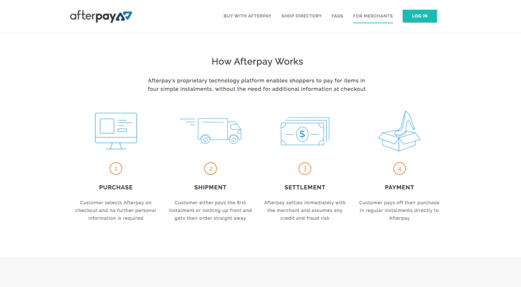
Screenshot: from www.afterpay.com.au
