From flat and thin design, to BIG imagery – we take a look at the year that was, and the best web design trends of 2015.
Make it BIG
One of the biggest trends to impact web design in 2015 is the use of full screen imagery – often photographic – with minimal overlaying text. Home pages featuring a single oversized graphic above the fold is still a hot trend and will be well into 2016 – we predict! Max the size, max the impact!
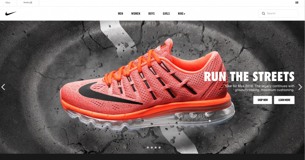
Screenshot taken from nike.com.au
Websites who use this trend well include: airbnb.com.au and nike.com.au
Parallax & Innovative scrolling
Long one-pagers have become widely used amongst web designers. Scrolling is not only considered more acceptable for the User Experience on their desktops, it’s also very mobile friendly and it looks pretty cool too. Infinite scrolling can even lower your bounce rate, according to Time.com, their bounce rate dropped by 15% after they adopted “continuous scroll”. Thanks to mobile, this certainly is the era of the “scrollers”, but not just long page scrolling – many innovative web designers are setting the pace for 2016 with some great utilisation of Parallax scrolling. Not to be overused, this trend is great for digital storytelling, and for the flow of your website. The trend which provides the user with a 3D effect as you scroll down the page is caused by a slow moving background combined with a faster moving foreground.
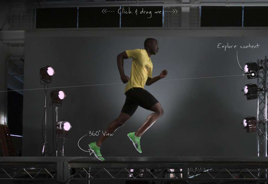
Screenshot taken from au.puma.com
To see some of the best parallax scrolling examples to hit the web this year, creativebloq.com has narrowed down some great examples.
Icon Fonts
Icon Fonts have proven to be the simplest way to generate a set of icons, ones that are not only consistent in style, ones that are easily modifiable and resizable – which is great for responsive design. The second reason that icon fonts have been so widely used in 2015, is that they sync perfectly with the Thin Line and Line Art logo trend – mentioned below. The best news is that there are loads of free downloadable icon fonts available. We generally use the fonts from over at Font Awesome.
Screenshot taken from designroast.org
Tiles, tiles, tiles
Considered one of the most popular ways to structure content in 2015, the tile format leads the way in terms of responsive layouts, and aesthetically pleasing design. If this “boxy” trend makes you yawn just thinking about it, try thinking outside of the box, literally, tiles don’t need to be rectangular, or even square. In fact softer edges, angular shapes, hexagons, you name it, you will have no doubt seen this trend popping up time and time again throughout 2015.
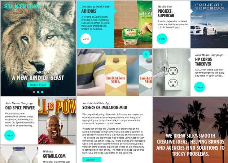
Screenshot taken from pinterest.com
Flat Design
This design trend has been huge throughout 2015, and will no doubt carry through into the New Year. The key principle of Flat Design is that it is based on a 2D style that is simply that, flat. This means no drop shadows, feathering, gradients or basically any depth – designer restraint required! The Flat trend has not only taken graphic design back to basics, it has propelled the simple, clean, design trend further forward, which we love.
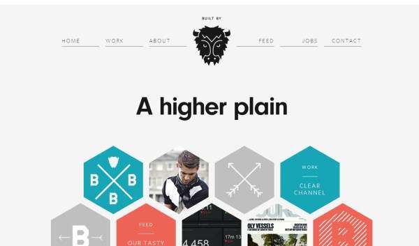
Screenshot taken from builtbybuffalo.com
Thin is IN
Back to the minimalist design trend, thin is definitely in. This means thin icons, thin fonts and working with fine lines to portray your messaging. The Thin trend has even come into play with logo design, proving to have a huge influence in branding and rebranding over the past 12 months. Some of our favourite examples of this ongoing trend can be seen at naldzgraphics.net
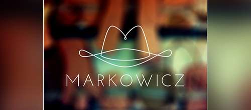
Screenshot taken from naldzgraphics.net
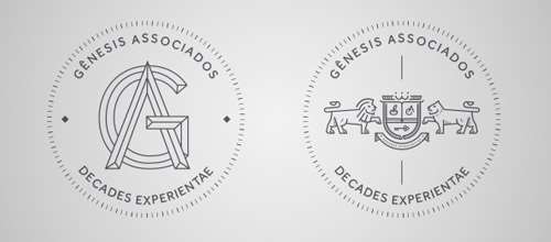
Screenshot taken from naldzgraphics.net
Want to know what’s in store for web trends in 2016? We will be sharing our predictions for the New Year in January. Be sure to visit us again then!
