So, you’re ready to take your business to the next level and launch your online shop. Great! But have you thought about what your ecommerce site requires to really turn profits? An online shop is more than just good product pictures and a checkout function, you also have to think about the experience you’re giving your customers. Online shopping is a competitive space, so what does it take to build a great online store? Here are some essential must haves to make your shop a success.
1. Good Experience for Mobile Shoppers
In 2013, 55% of people purchased from mobile devices rather than from PCs and laptops, so ensuring that your ecommerce website is mobile friendly is a must. Mobile’s increasing market share means that your online shop should have a mobile first strategy to ensure you’re getting conversions no matter what device.
- ensure your checkout cart functions easily on mobile
- make sure the mobile navigation is easy to use
- keep your mobile version clean, simple with clear links and call to action buttons
- check out, page navigation and ‘next’ buttons have enough space so fingers/thumbs can tap on them easily
- good mobile versions of your images, including images for retina display
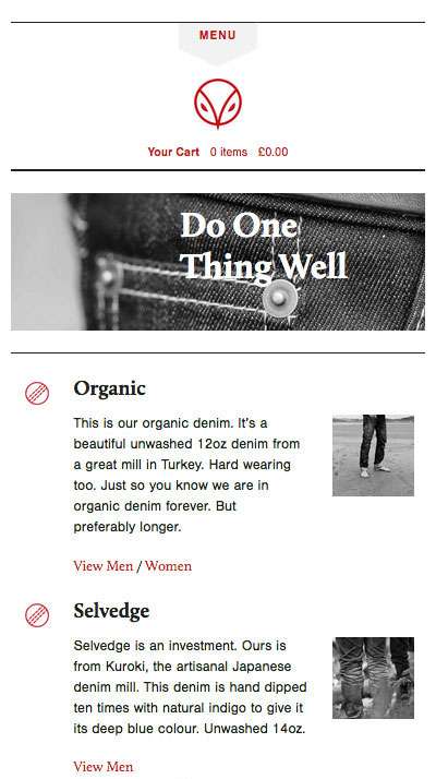
Hiut Demim’s mobile version of their shop is clean, simple and easy to use on mobile.
2. Easy Checkout Process
The biggest conversion killer for your online store is potentially your checkout process. You could easily be losing up to 67% of customers if your checkout is poorly planned or designed. Striking a balance between good functionality, usability and building trust are key to offering a good checkout experience.
- have a big clear ‘checkout’ button
- don’t present unexpected costs at checkout
- optimise your site for load time, ensure it’s fast (particularly on mobile)
- make editing the cart contents easy
- show shipping clearly
- show images of the products in the cart
- display security logos
- keep your checkout simple and clean, less clutter is better
- make contacting support easy
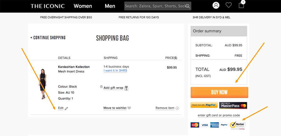
The Iconic has good checkout pages that help convert.
3. Guest Sign Ups
Laborious registration forms can increase the likelihood of your customers abandoning a purchase at checkout so give customers the option to checkout as a guest rather than register an account. Online shoppers are keen to make their purchases quickly and can easily be distracted, so help them (and you) achieve their goal by giving them a quicker option to check out as a guest user.
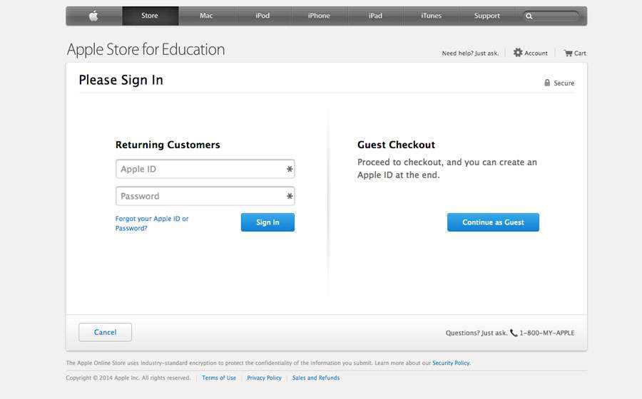
Apple’s store let’s customer’s quickly make a purchase as a guest
4. Good Quality Product Photography
Product photography could be the single most important aspect of your ecommerce site. This is what helps your user get ‘buy in’ and is often the first experience of your product, so make it count.
- it goes without saying but ensure your images are high quality with good lighting
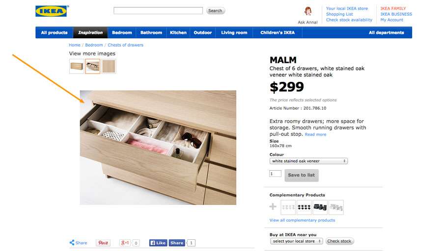
- give your customers the option to see the product in context or being used so they can relate to the experience of using your product
- include a gellery of images to show all features of the product
- let customers see a larger version of the photograph either in a lightbox or zoom function
5. Have a Clear Returns Policy
The first part of a good returns policy is to try to prevent the return. People return their products when they’re disappointed so write clear and accurate product descriptions. However having a well structured and easy to find returns policy can actually help your customer make the decision to purchase because they feel confident they can get a refund or exchange easily if there’s an issue.
- make your policy easy to find
- write in easy to understand language, no legal or internal policy jargon
- don’t include hidden return costs, be explicit and clear about costs (if there are any)
- be clear about whether the return is for cash, exchange or credit
6. Detailed Product Descriptions
This may sound obvious, but clear and accurate descriptions about your products are important to help buyers make the decision to purchase. Your descriptions act like your store’s sales staff so it needs to be informative and the right tone for your target. Include an FAQ’s section too to help alleviate any doubts about your products. Include information about
- clothing size
- texture
- dimensions, weight
- materials or fabric used for the products
- warranties
- colours
Capture the imagination of your customers and be creative with your descriptions, tell the story of your product and how it can benefit your customer. Will it save them time, money, make them more productive or keep them safe? Appeal to your customer’s emotional needs and show them the benefits of your product and how it will make their life better. Crumpler bags do an excellent job of their descriptions, and they even include videos of their products being used – nice!
7. Clear Design & Intuitive Navigation
Get clear about your shop categories and how you’re online store is structured. Poorly structured sites don’t perform well and struggle to convert. The goal is to make it easy for your customers to find what they’re looking for. Work with your web designer and your team to understand how your products should be categorised. Make sure your navigation is intuitive with labelling that makes sense to your customers. Sometimes how your company labels something may not appeal to, or be confusing to your customers. Do your research.
- most important pages in the main navigation
- be clear about what is an attribute and what is a category
- do user testing to discover the best labels for your navigation
- if it’s too big, simplify it
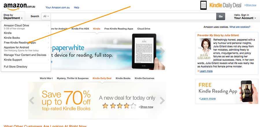
Amazon shows the most important pages first and then links to ‘full store directory’
Ensuring your online store has a user focused design and works across all devices is key to increasing conversions. Do user testing and set conversions goals to track how your site is performing so you can set a baseline for your initial review.
