In our last blog, we raised our champagne flutes to the best web design trends of the year – and wasn’t it a great one! So for our first blog of the New Year, what better to focus on than web design trends in 2016? In no particular order, these are the trends we think will be taking the web design world by storm over the next 12 months (at least) – and we can’t wait to implement some of them into our own exciting new projects!
Back to the 80’s
2016 could just be the year that the big, bad, bold colours of the 80’s make a comeback. In fact, we’ve already noted some great examples of how bright, bold colours (including neons!), combined with 2015’s hero flat design trend are taking over – and we’re kinda diggin’ it. Another 80’s inspired trend that has been popping up is pixelation, not only in fonts, but photography also. Definitely one to watch in 2016.
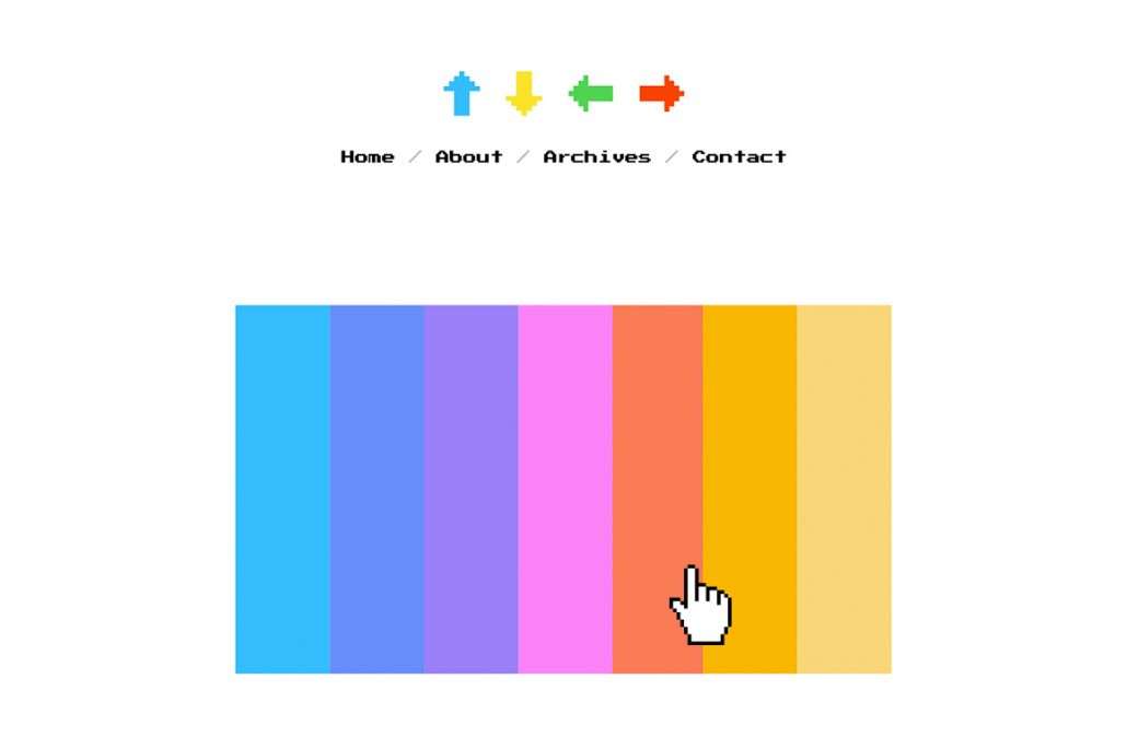
Screenshot taken from creativemarket.com
Typography + handwriting
Perhaps an ode to our physical existence merging with our online lives, typography trends are all pointing towards handwriting, handwriting, and more handwriting. This personalised font trend has already reared its head in 2015, with 2016 set to be the year we see it appear in logos, business cards, and websites. The reason we are all for the handwriting trend? It’s personal, tangible, and it’s oh so aesthetically beautiful – especially when used in ways such as these…
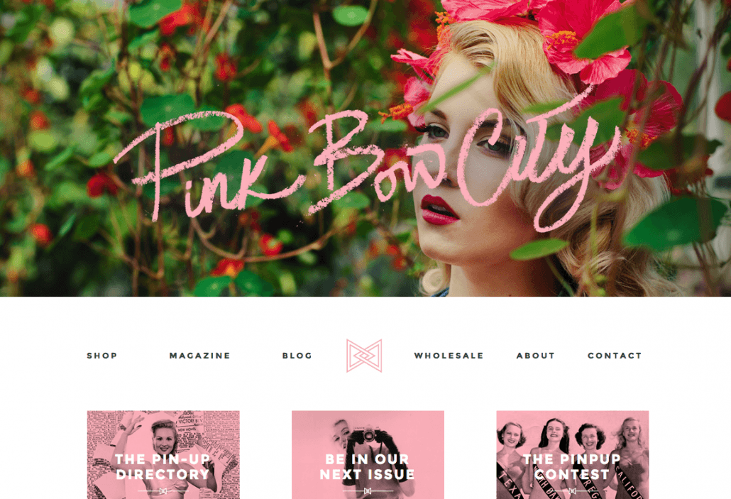
Screenshot taken from pinkbowcity.com
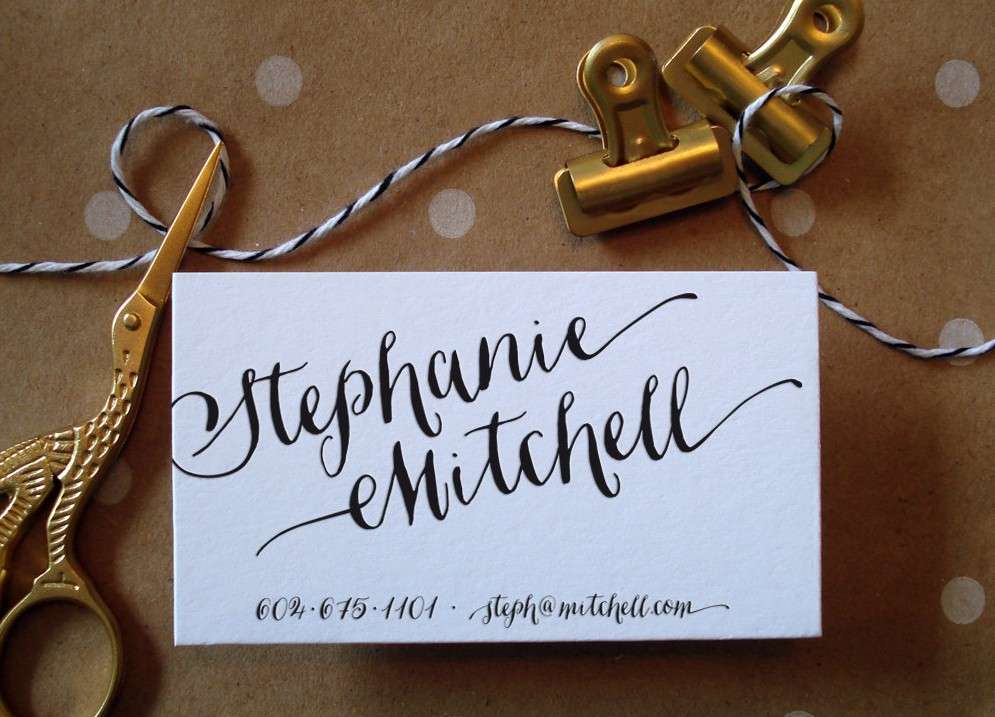
Image courtesy of Sunlit Letterpress Etsy Store
Minimalism maximised
We covered off flat web design and thin fonts in our last blog, but word on the street is that minimalism is about to get even more… minimalist, if you will. So this year, we will be saying goodbye to multiple paragraphs of text, and hello to clean, almost stark, pages with minimal information. This trend will give the user a taste of the experience to be had on site, while allowing them to use their imagination and ideally making them thirsty for more! This trend is already creating maximum impact as web designers truly embrace the less is more mantra.
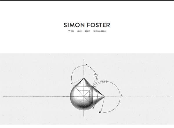
Screenshot taken from simonfosterdesign.com
Card based design
A step up from the use of tiles in web design – seen almost everywhere in 2015, card based design is a deeper element of web design incorporating functionality and the possibility of interactivity. The card feature gives the site an opportunity to provide the user with more information, easily i.e flip or hover over the card for more info, or a basic invitation to do more on site. We predict that we will see this feature change the way we online shop i.e shifting away from scrolling, and enhancing further the quick view feature.
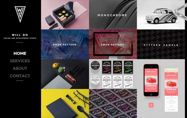
Screenshot taken from willdo.lt
SVG Animation
SVG Animation is a bit of a beast to truly understand, but in a nutshell, it will allow us to wave goodbye to Flash, and hello to rich, smooth and seamless animations. SVG is predicted to solve web browser compatibility issues as well as performance problems. So those amazing animations will come to life for ALL to see, at last! To give you a feel for the trend, the sites who were credited for excellent SVG animation in the latter part of 2015 can be found here at the AWWWARDS website.
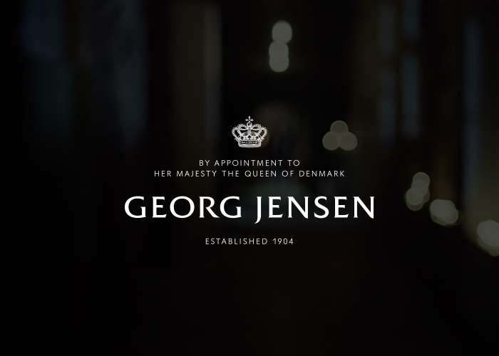
Screenshot taken from AWWWARDS.com
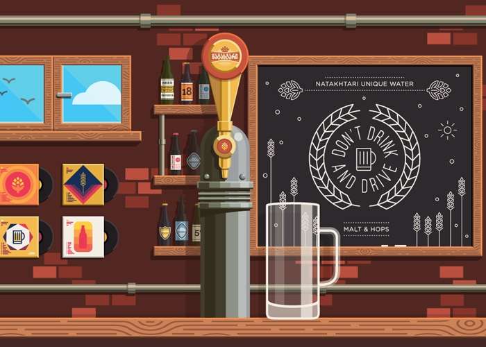
Screenshot taken from AWWWARDS.com
Of course, as we enter a New Year we can’t forget the best of 2015 that will no doubt follow us throughout 2016. See our latest blog for info on BIG graphics, parallax scrolling and more right here.
